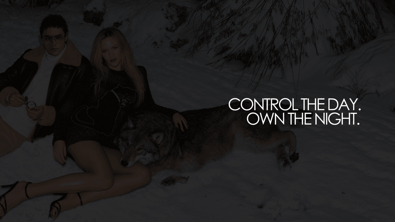
Philipp Plein FW26 Campaign Study
A self-initiated study: can generative AI produce a full luxury campaign that holds together visually, narratively and commercially, when a human owns the creative direction?
Generative AI is changing how fashion content is produced, but most AI campaign work still looks like AI work. I wanted to test the opposite: pick one of the most maximalist brands in fashion, give myself a real brief, and direct generative tools the way I would direct a production team.
Research came first. I studied the brand and its founder, the full FW26 runway show, editorial coverage, competitors and luxury consumer behavior, structured through the Double Diamond.
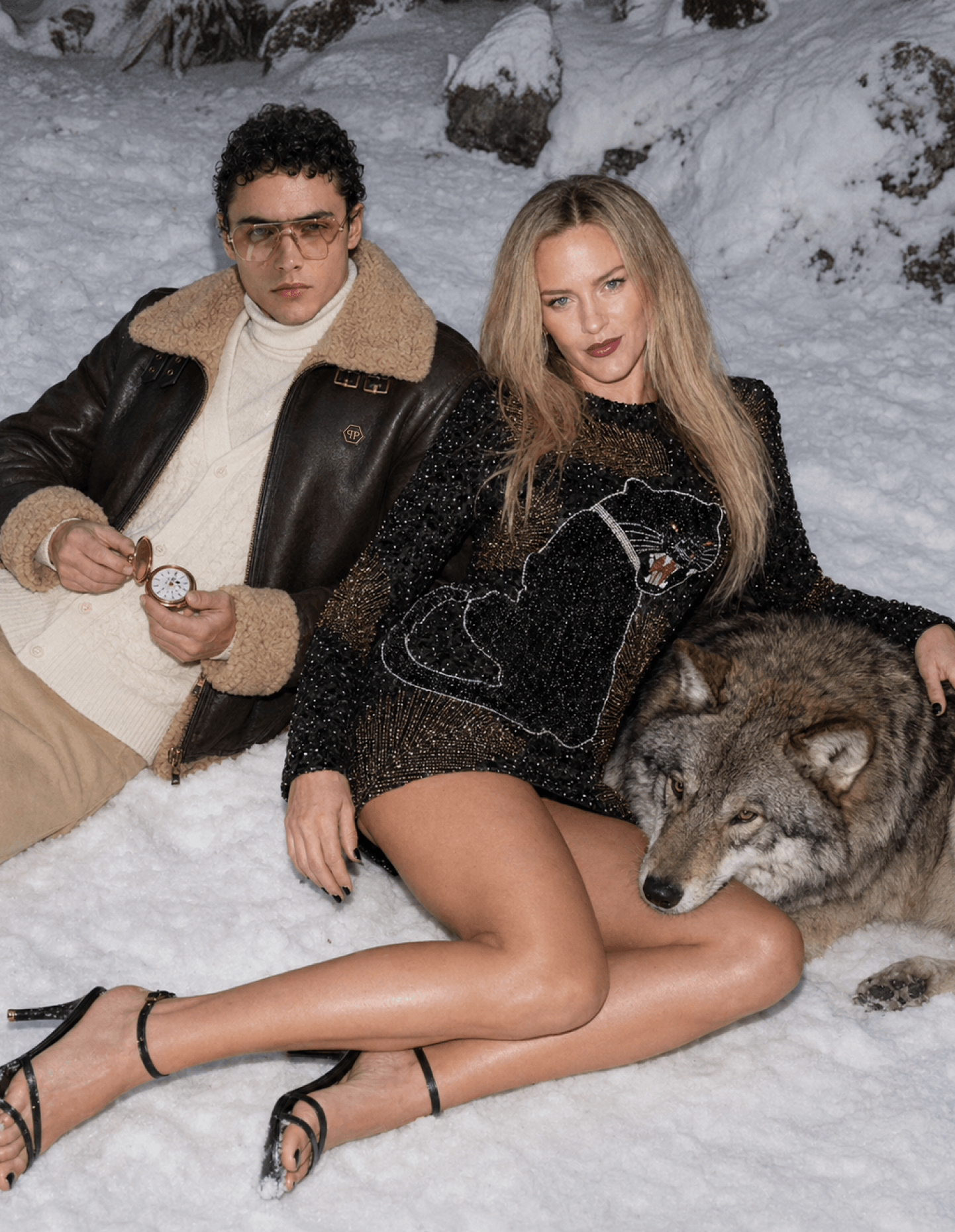
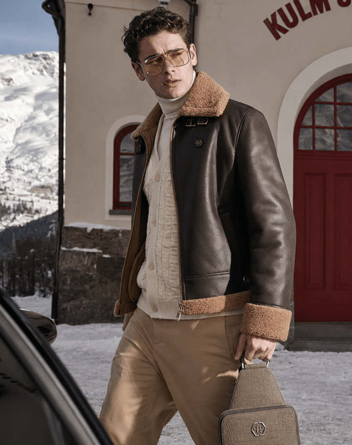
What emerged: FW26 is a wardrobe for luxury winter travel. Composed by day, unleashed after dark. That duality became the campaign, Control the day. Own the night., set in the one place that embodies both: St. Moritz.
AI as a production tool under human creative direction
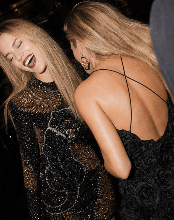
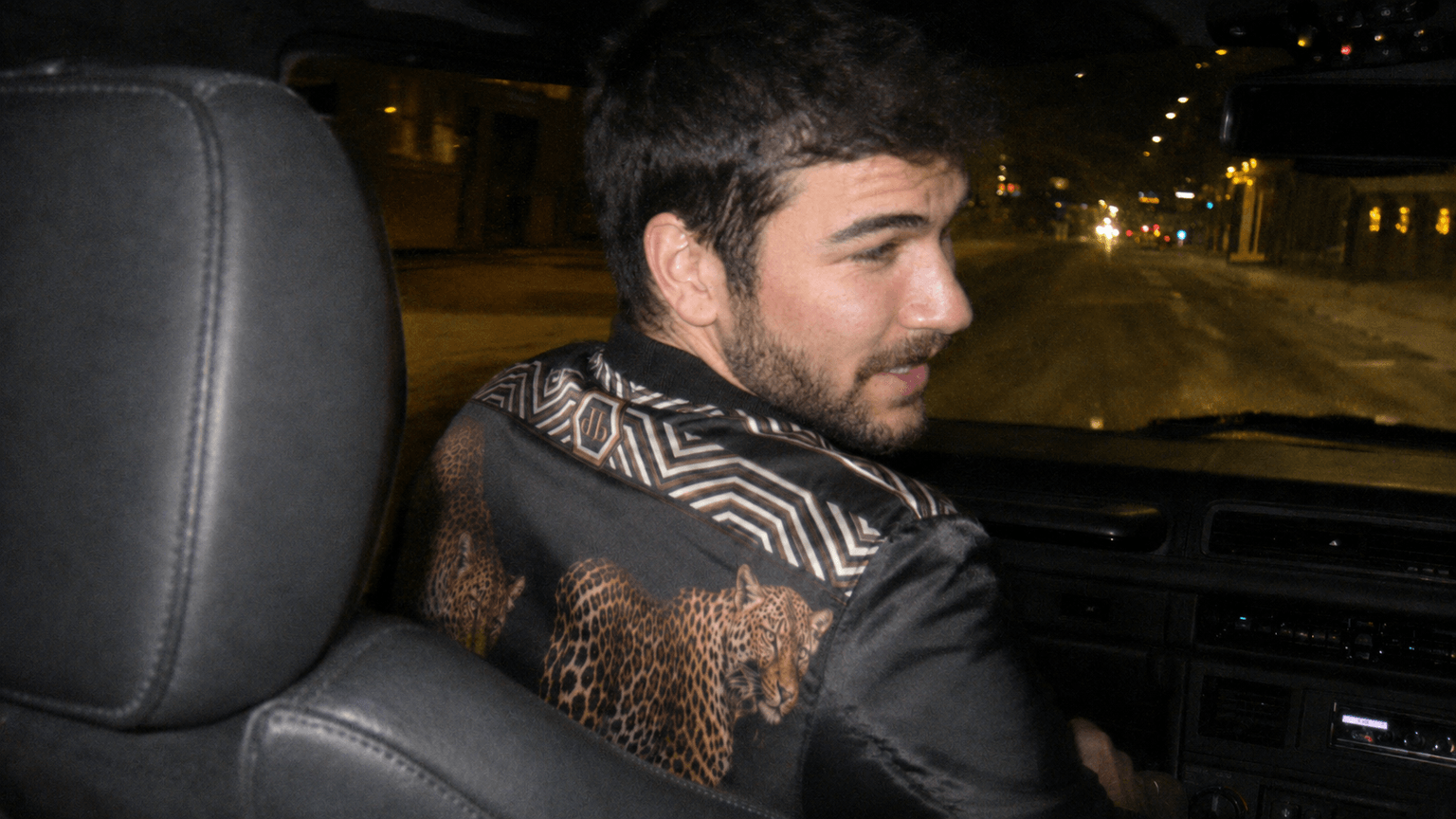
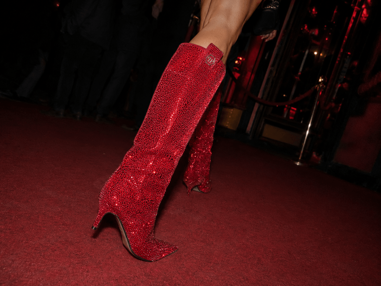
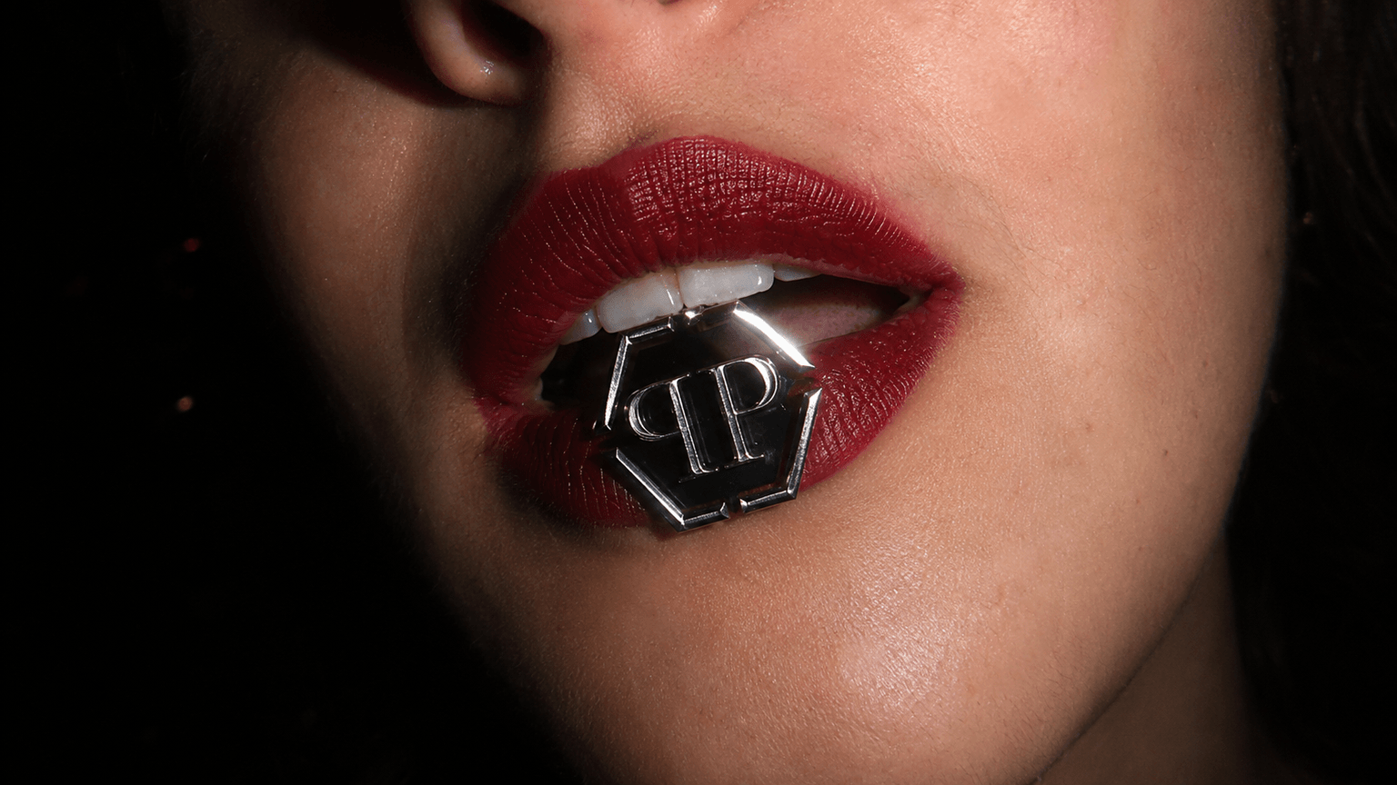
The rule I set myself: AI generates, I direct. Every output had to serve the concept, the brand codes and a deliberately chosen early-2000s Canon aesthetic, not the model's default look.



What I learned about probabilistic tools
≈5×
images generated for every one that made the final selection
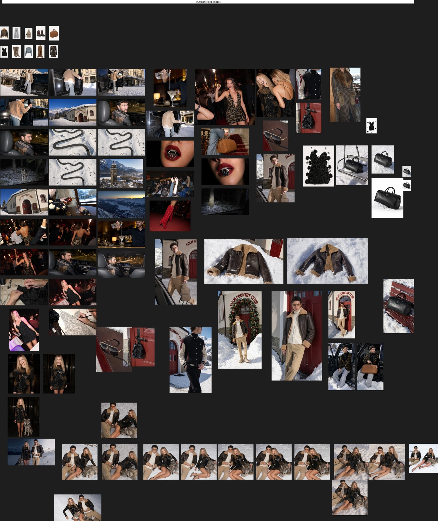
Generation is cheap; selection is the work
Roughly five images were generated, compared and discarded for every one that made the campaign. Most of my time went into searching, culling and selecting, not prompting.
Consistency is the hard part
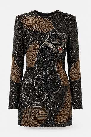
Keeping one product, one model and one light across images and motion meant recreating FW26 pieces from runway screenshots and iterating against each tool's own biases.
Direction doesn't get automated, it gets amplified
The tools multiplied my output, but every decision that made this feel like one campaign instead of a mood board was human.
What I delivered
Responsive homepage concept across desktop, tablet and mobile
Three researched UX improvements: header, product card and footer
FW26 launch film, AI-generated under my creative direction
Editorials, packshots and campaign imagery, with products recreated from public runway footage
Component-based Figma system with variables, auto-layout and design tokens, structured MCP-friendly
Nine-post Instagram launch campaign and a launch newsletter
Full research and design process documented in FigJam
The Instagram launch
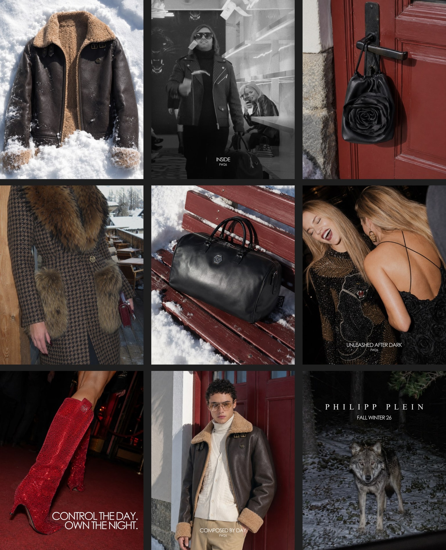
A nine-post feed composition introducing FW26 through movement, attitude and the PLEIN lifestyle. Retro-inspired collection reels, runway and celebrity moments that keep the brand culturally present, and a closing carousel that takes followers inside the collection. Luxury communication should create identification before asking for conversion.
The launch newsletter
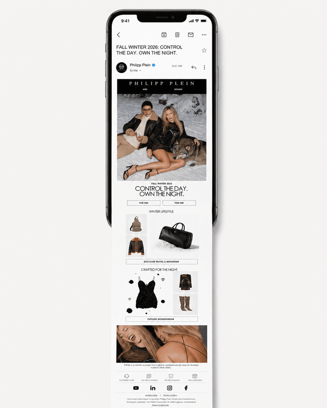
The FW26 launch newsletter brings the campaign into the inbox: modular blocks designed to be technically achievable in real email clients, without sacrificing the campaign's visual identity.
Three researched UX improvements
The study is not a reskin. The design was built on the existing e-commerce, respecting its catalogue, content and technical limitations. On top of it, I documented three improvements grounded in usability research rather than taste.
Header
Product categories visible at the first navigation level (hidden navigation cuts discoverability by almost 50%, NN/g), plus a contextual utility bar for location, language and support.
Product card
The product name leads the hierarchy, store-wide messages moved to a global highlights section, and sizes, colors and extra angles appear on hover.
Footer
A new global benefits area collects store-wide messages in one place, redesigned with metallic cues worthy of the brand.
This study is why I believe the next design roles are hybrid: the value is not in operating the tools, it is in knowing what to ask of them, and what to reject.