Euvetia Website
Trust-first landing page for a high-ticket relocation platform for Brazilians with EU passports who want to move to Switzerland.
Check the final project live here
Project overview

Role
Digital product designer

Timeline
Aug 2025 - Sep 2025

Team
1 designer, 1 engineer

Launch
April 2026
Role
Digital product designer
Timeline
Aug 2025 - Sep 2025
Team
1 designer, 1 engineer
Launch
April 2026


This project focused on the website. More specifically: the landing page that had to turn interest into purchase.
That made the page strategically important. A good platform would not matter if we could not sell it clearly and credibly.
I led the landing page from strategy to design. That included research synthesis, positioning, information architecture, wireframing, UX writing, responsive UI, interaction rationale, and developer handoff.


Why this page mattered
This was not a low-risk purchase.
The product had a high entry price.
The topic was life-changing.
The user was often anxious, overloaded, and afraid of making an expensive mistake.
So the real challenge was not showing features.
It was helping the right people feel safe enough to move forward.
And helping the wrong people understand, with honesty, that the product was not for them.
The challenge
We were designing for a very specific audience:
Brazilian citizens with an EU passport who were planning to move to Switzerland.
Some users arrived from YouTube and Instagram. They already knew the founder and the story behind the product.
Others arrived from Google. They knew the topic, but not necessarily Euvetia.
The page had to work for both groups.
It had to answer five questions fast:
How will this help me?
Can I legally move?
Can I afford the move?
Why should I trust this?
Why pay for this instead of searching on my own?

I reused relevant insights from the platform research, YouTube and Instagram questions and personas. Then I reframed them for a sales context.

Core insight
For this audience, trust had to be designed before conversion could happen.
That led to some product decisions:
Clarify
Explain what Euvetia is, who it is for, and what problem it solves.
Reassure
Show signals of credibility early: official data, plain Portuguese, one-time payment, transparency, social proof.
Make the value tangible
Translate user pain points into concrete tools and outcomes.
Humanize the offer
Use video, founder presence, and community signals to reduce distance and build trust.
Reduce risk
Explain the pricing model, the refund policy, and what the user gets before asking for commitment.
What useful friction looked like
One of the most important decisions was also the least obvious.
We did not remove all friction before purchase.
We added a deliberate step before payment: an eligibility and fit form.
This was the main CTA of the page.

Before buying, users went through a short guided eligibility flow designed to assess whether Euvetia was the right fit for their case.
At the end, they received a positive or negative result.
If the result was positive:
The user saw a message that explained what Euvetia could do for them, how the platform worked, and why it was relevant for their specific journey.

If the result was negative:
We were transparent. In some cases, the user lacked legal means or real readiness to move. We chose not to push the sale anyway.
That mattered.
It showed that the product was not built to sell false hope.
It was built to guide the right people responsibly.
This was one of the strongest trust decisions in the project.

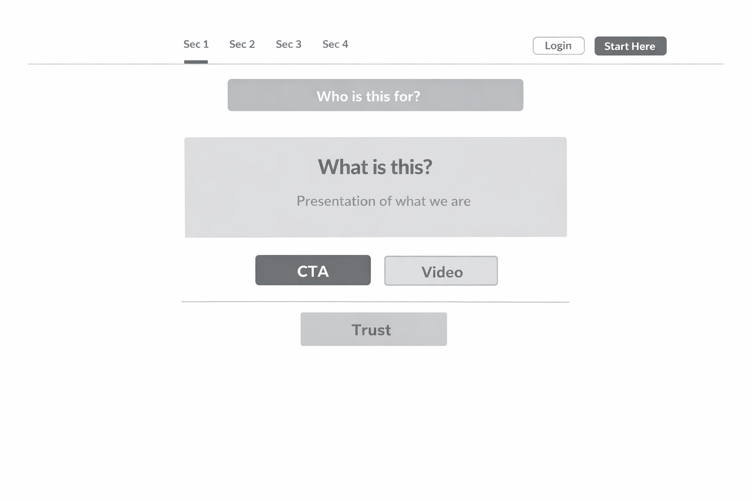
Core sections and my line of reasoning
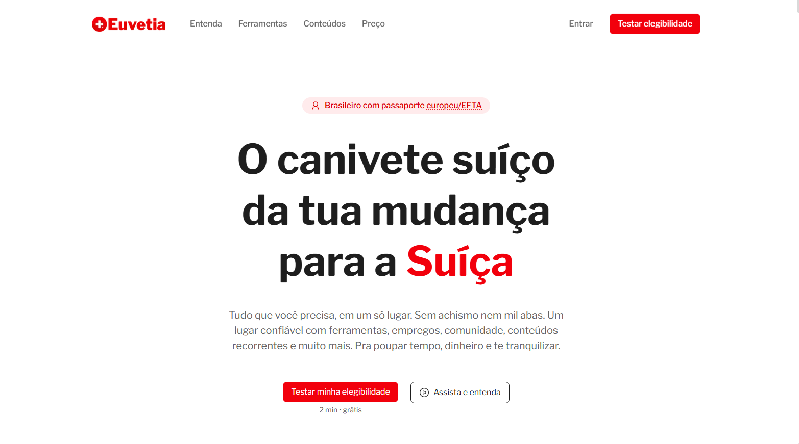
Hero
Knowing that the first three seconds are crucial, the hero had to talk quickly:
this is for Brazilians with an EU or EFTA passport
this is about moving to Switzerland
this is a structured product, not generic content
the next step is simple
The visual metaphor of the Swiss Army knife came from the product thesis itself: everything you need in one place.

Video
The video was there to speed up understanding and increase engagement.
+40%
Additional time spent on a page with video
It was a nice way to show the "soul" behind the product and demonstrate our commitment to producing high-quality content.

Pain points into tools
The next sections turned emotional uncertainty into concrete product value.
Instead of listing all platform features, I grouped the offer around real user questions:
"Will the math work?"
"Where should I live?"
"I’m afraid of bureaucracy."
"What about work?"
"I want a smooth first month."
"I don’t know what I don’t know."
This made the platform easier to understand. It also made the copy more human.
Each block followed the same logic:
pain point: what the user is worried about
product response: the tools or guidance that reduce that uncertainty

Social proof
We placed social proof throughout the page, not in just one isolated section.
After introducing a feature, benefit, or part of the experience, we supported it with positive user feedback related to that specific point.
This helped connect each promise to a real response from the community, making the value feel more concrete as users moved down the page.
Free permit checker
The free residence-permission checker appeared later on purpose.
Placed too early, it would split attention.
Placed later, it strengthened the offer without competing with the main path.
It became a secondary trust builder and a bridge into a larger product ecosystem.
Read the full permit checker case study here

Writing for clarity
The page dealt with migration, legality, and money. That made language design a core part of the work.
I avoided jargon whenever possible.
When we had to use a more specific term, I made sure it was explained in place. One example was the “EU/EFTA citizen” label. In the interface, we added a hover state that clarified which countries it included.
This reduced confusion without increasing visual noise.
The rule was simple:
Use real words.
Explain the hard ones.
Never hide meaning behind expert language.

Visual direction
The visual system followed the same strategic goal as the content.
Build trust.
That led to a Swiss-inspired direction with:
strong hierarchy
disciplined grids
high contrast
restrained color use
simple iconography
minimal but purposeful motion
The principle was: less, but better.
Animations were used to explain, guide attention, and create continuity. Not to decorate the page.
This mattered because the user was already carrying a lot of cognitive weight. A noisier interface would make the offer feel less trustworthy.
System thinking and handoff
This project also shows how I work with engineering.
I organized the Figma file around reusable components, section-based structure, tokens, and responsive behavior. One component lived on one page. Motion references and implementation notes were documented to support build quality.
The system included:
design tokens
component pages
section components
responsive layouts
mobile design
behavior notes
animation references for handoff
This made the work easier to scale and easier to build.
It also made decisions easier to trace. The structure in Figma reflected the structure of the product.

Outcome
Although the landing page launched very recently, the first signals were already useful:
in the first three days, PostHog showed a 64% conversion rate from the landing page to the eligibility test
52% of landing-page traffic came from the YouTube channel
The next step is to keep reviewing session replays, improve the experience based on real user behavior, and turn Instagram into a stronger acquisition and sales channel as well.