Permit checker
Swiss residence permit checker that turned dense immigration rules into a short, visual, personalized result.
Check the final project live here
Project overview

Role
Founding product designer

Timeline
Jan 2026 – Feb 2026

Team
1 designer, 1 engineer

Tools
Figma, FigJam, PostHog
Role
Founding product designer
Timeline
Jan 2026 – Feb 2026
Team
1 designer, 1 engineer
Tools
Figma, FigJam, PostHog


The product ecosystem
The checker was not an isolated feature.
It was part of a larger product ecosystem.
We have a platform that helps people move to Switzerland.
The permit checker is a tool inside the platform and on the sales website.


This project started with a very practical question:
Can I legally live in Switzerland?
For our audience, that question came before everything else. Before content. Before tools. Before paying for the platform.
So we built a free residence permit checker that helped users understand their likely legal path in Switzerland through a short anonymous flow and a personalized result page.
The challenge was not form design.
It was translation.
We had to turn Swiss immigration law, canton-level variation, and real-life edge cases into something people could understand in minutes.
At its core, this was a translation project. Not between languages. Between law and real life.

The problem
Most users wanted to know whether moving to Switzerland was legally possible for their case before investing more time, emotion, or money.
That meant the product had to answer three things fast:
whether a legal path likely existed
what type of permit could apply
what that result actually meant in real life
This was especially important because false optimism would have been harmful. We chose to be useful, realistic, and transparent.
Research and structure came first
Before drawing interfaces, we mapped the logic.
We used FigJam to structure the decision flow and define which variables actually changed the outcome. We did not want a long intake form. We only asked what materially affected the result.
Some questions included:
What is your main goal in Switzerland?
Do you hold EU/EFTA citizenship?
What is your family composition?
What financial resources do you have?
If applicable, what is your contract duration?
Some questions appeared only when relevant. Others never appeared, depending on previous answers.
This kept the flow short while preserving legal usefulness.

The work was grounded in:
previous platform and website research
personas and pain points already validated through our audience (YouTube and beta users)
Swiss legislation
direct confirmation with cantonal immigration offices when financial thresholds were involved
This was where the product work really happened.
The form was short. The logic was not.
The user saw a lightweight flow.
Behind it, we mapped 19 possible result screens across larger groups such as:
job seeker
employee
entrepreneur
study
retired
Some outcomes were positive. Some were uncertain. Some were negative.
The logic stayed honest.
If the law clearly did not allow a path, we said so. But even in negative cases, we did not end the experience with a dead end. We showed next steps, alternatives, or useful content paths instead.
That was an important product decision. Clarity did not have to feel cold.
From legal text to visual explanation
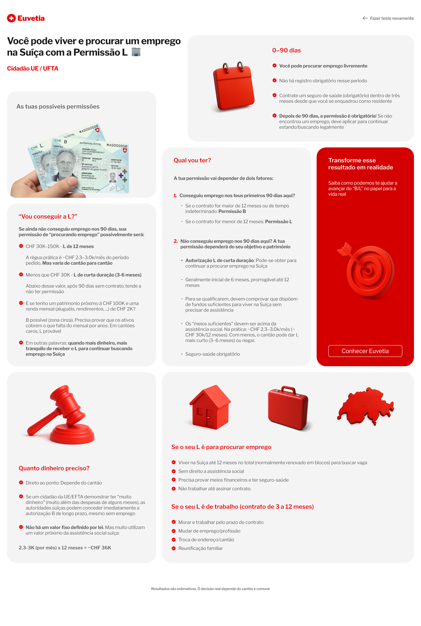
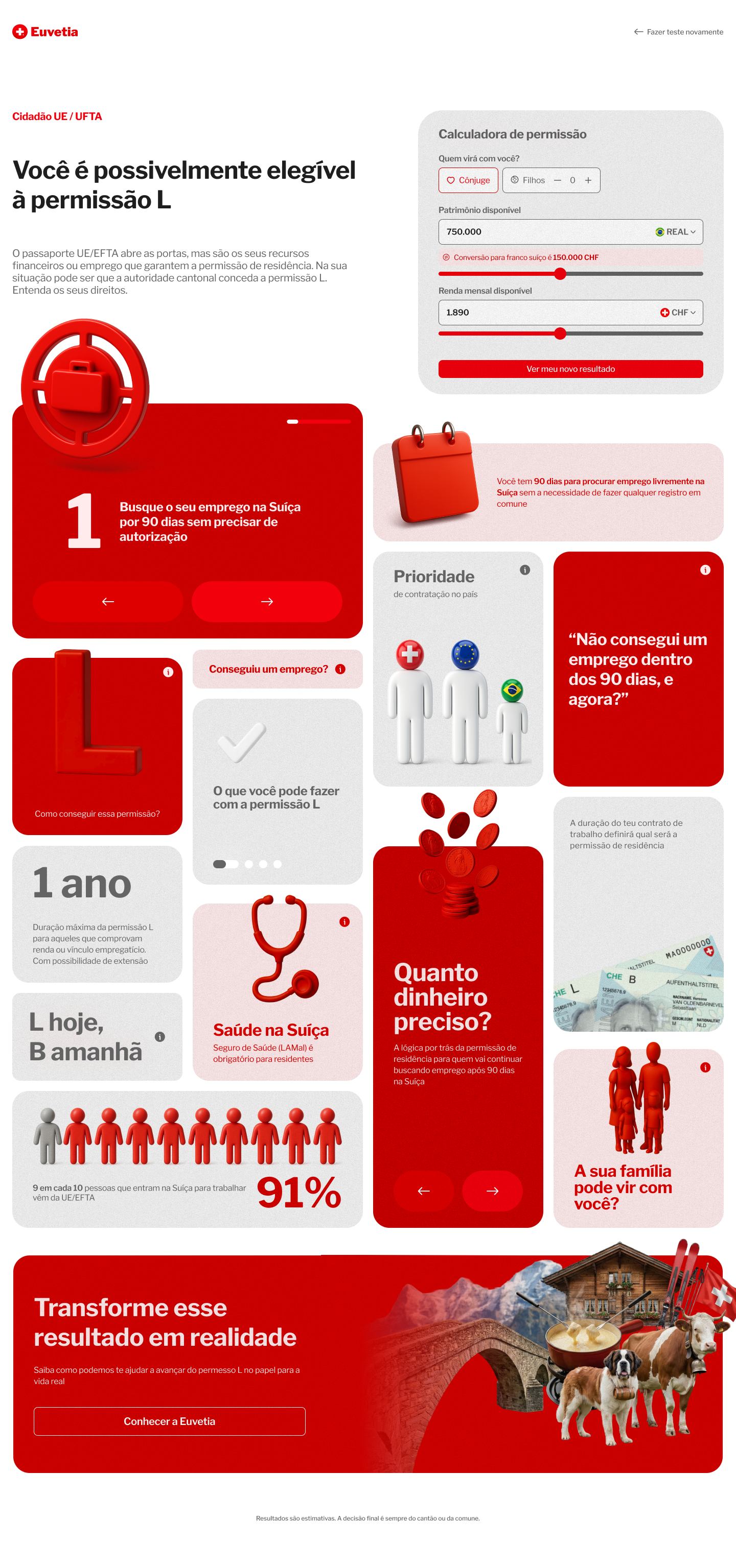
The result page was built as a bento box system.
We chose this format because the information was dense, but not linear. Users did not need one long article. They needed a visual answer made of small, independent explanations.
Each result started with the main answer first:
What permit is likely relevant for this case?
Then the supporting cards explained:
why that permit applied
what could change the result
practical consequences
family implications
financial requirements
duration
health insurance
hiring priority
next steps
The goal was not to show everything.
It was to show what mattered for that case.
Version one vs. version two
The first version was correct in content, but weak in communication.
It had fewer cards and too much information packed into each one. The interface felt dense and less inviting than it needed to be.
The final version broke the experience into smaller, more focused units. Each card became its own small world. Easier to scan. Easier to trust. Easier to remember.
Designing for uncertainty without pretending to be legal advice
Some scenarios were straightforward. Others depended on cantonal interpretation, especially when money was involved.
In those cases, we always showed how the estimate was calculated and made it clear that the final decision belonged to the cantonal migration authorities.
We used Ticino as the financial baseline because it was one of the few cantons that publicly provided minimum income thresholds. This gave us a concrete public reference point, although we explicitly labeled those outputs as approximate.

Building a reusable result system
To keep the experience scalable, I built the result screens with a modular tile system inside the same Figma file as the website, but in a dedicated component area.
We used a clear naming pattern: Tile[kind].
Each tile was a reusable content card that could be filled with different data, iconography, and behavior depending on the case. This made the checker easier to maintain, expand, and hand off.

The UI also followed a clear internal system:
a dedicated bento grid
reusable card structures
three surface color options
three icon styles tied to the Swiss visual language
interactive cards when deeper explanation was needed
simple, human language throughout
I carried the same logic into the Figma files, organizing them in a way that was structured, consistent, and MCP-friendly. This made the handoff easier for development, and the developer was able to complete all 19 screens in less than five days.


Validation
We first released the checker to beta users inside the platform.
Session replay showed that the experience was clear and intuitive enough to use without assistance. After that, it launched publicly in April 2026 as a free tool.
Because the checker was part of a larger ecosystem, it also acted as a qualification layer. Positive outcomes could lead users toward Euvetia. Negative outcomes could redirect them to more appropriate educational content, including the founder's YouTube channel.